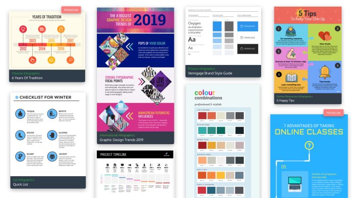
Designing Infographics kicks off with a bang, exploring the world of visual communication in a fresh and captivating way that’ll keep you hooked. Get ready to dive into the art of creating engaging visuals that speak volumes!
Introduction to Designing Infographics

Infographics are visual representations of information, data, or knowledge intended to present complex information quickly and clearly. They combine graphics, images, and text to communicate a message in a more engaging way than plain text. The purpose of infographics is to simplify complex data and make it easier for the audience to understand and remember.
Benefits of Using Infographics
- Easy to Understand: Infographics break down information into digestible chunks, making it easier for people to grasp complex concepts.
- Increased Engagement: Visual content is more likely to grab the audience’s attention and keep them interested.
- Enhanced Retention: People tend to remember visual information better than plain text, leading to better retention of the message.
Industries Using Infographics
- Marketing: Companies use infographics to showcase data and statistics in a visually appealing way to attract customers.
- Education: Teachers and educators use infographics to illustrate concepts and make learning more engaging for students.
- Healthcare: Hospitals and healthcare organizations use infographics to communicate medical information and promote healthy habits.
Elements of a Well-Designed Infographic

When it comes to creating a visually appealing infographic, there are several key components to consider. From color schemes to fonts to the balance of text and visuals, each element plays a crucial role in the overall design.
Color Schemes
Color is one of the most important aspects of an infographic. It helps to grab the viewer’s attention and convey information effectively. When choosing a color scheme, make sure to use colors that complement each other and enhance readability. Avoid using too many colors, as it can make the infographic look cluttered and confusing.
Fonts
The choice of fonts can greatly impact the overall look of an infographic. Make sure to use fonts that are easy to read and align with the overall theme of the design. Avoid using too many different fonts, as it can make the infographic appear unprofessional. Stick to a maximum of two or three fonts for a clean and cohesive look.
Imagery
Images and icons are essential in conveying complex information in a visually appealing way. Make sure to use high-quality images that are relevant to the content and help to reinforce the message you are trying to convey. Avoid cluttering the infographic with unnecessary visuals and focus on using imagery that enhances the overall design.
Balance of Text and Visuals
Finding the right balance between text and visuals is crucial in creating an effective infographic. Too much text can overwhelm the viewer, while too many visuals can distract from the main message. Aim to use visuals to supplement and enhance the text, making the information easier to digest and more engaging for the audience.
Tools and Software for Creating Infographics
When it comes to designing eye-catching infographics, having the right tools and software at your disposal is crucial. Let’s explore some popular options used by graphic designers and content creators alike.
Adobe Illustrator
Adobe Illustrator is a powerful vector graphics editor that is widely used for creating visually appealing infographics. Its robust features allow for precise control over elements, making it a favorite among professional designers. However, beginners may find the learning curve steep due to its advanced capabilities.
Canva
Canva is a user-friendly online design tool that offers a wide range of templates for creating infographics. It is known for its simplicity and drag-and-drop interface, making it ideal for beginners or those with limited design experience. Canva provides a quick and easy way to design beautiful infographics without the need for extensive training.
Piktochart
Piktochart is another popular online tool specifically designed for creating infographics. It offers a variety of templates, icons, and graphics that can be customized to suit your needs. While Piktochart is more user-friendly compared to Adobe Illustrator, it still provides enough flexibility for creating professional-looking infographics.
Visme
Visme is a versatile design tool that allows users to create not only infographics but also presentations, reports, and other visual content. It offers a range of templates and design elements to choose from, making it a great option for those looking to create engaging infographics with ease. The platform is intuitive and easy to navigate, catering to users of all skill levels.
Infogram
Infogram is a data visualization tool that focuses on creating interactive and dynamic infographics. It is ideal for showcasing data in a visually appealing way, making complex information easier to understand. While Infogram may have a steeper learning curve compared to other tools, its advanced features and customization options make it a valuable asset for data-driven infographics.
Data Visualization Techniques in Infographic Design
Data visualization plays a crucial role in infographic design as it helps to make complex information more easily understandable and visually appealing to the audience. By presenting data in a visually engaging way, it allows viewers to quickly grasp the main points and trends without getting overwhelmed by numbers and text.
Bar Charts
Bar charts are commonly used in infographics to compare different categories or show changes over time. They are effective in displaying quantitative data and making comparisons between different data points easily identifiable.
Pie Charts
Pie charts are useful for showing the proportion of different categories in relation to a whole. They are great for illustrating percentages and relative sizes of different components within a dataset.
Line Graphs
Line graphs are ideal for showing trends and changes over time. They are effective in highlighting patterns and relationships between variables, making it easy for viewers to interpret the data.
Infographic Icons
Using icons and symbols in infographics can help simplify complex information and make it more visually appealing. Icons can represent different data points or concepts, making it easier for viewers to understand the content at a glance.
Heat Maps
Heat maps are useful for visualizing large datasets and identifying patterns or trends based on the intensity of colors. They are effective in highlighting areas of interest and conveying information in a visually engaging way.
Tips for Creating Engaging Infographics
When it comes to creating engaging infographics, there are several best practices to keep in mind. By structuring your content effectively, incorporating interactive elements, and mastering the art of storytelling, you can enhance audience engagement and make your infographics truly stand out.
Structuring Content in an Infographic
- Start with a clear and concise title that grabs the viewer’s attention.
- Organize your information in a logical flow to guide the reader through the content.
- Use a mix of text, visuals, and data points to keep the infographic visually appealing.
- Keep the design clean and uncluttered to prevent overwhelming the viewer.
Making Infographics Engaging and Interactive
- Incorporate interactive elements such as clickable buttons or scrolling features to keep the audience engaged.
- Add animations or hover effects to make the infographic more dynamic and visually appealing.
- Include links to additional resources or related content for a more interactive experience.
- Encourage social sharing by adding social media buttons to allow viewers to easily share the infographic.
Storytelling Through Infographics, Designing Infographics
- Develop a narrative that guides the viewer through the information, creating a cohesive story.
- Use visuals to enhance the storytelling, making complex data more accessible and engaging.
- Consider the emotional impact of your content and use storytelling techniques to evoke a response from the audience.
- End with a clear call to action to prompt the viewer to engage further with the content or take the desired next step.